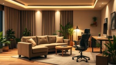
Color can instantly change a room’s mood. In Home Science and Interior Design, Color Theory is crucial. It helps create stunning spaces that evoke specific emotions and atmospheres.
Colors greatly influence our psyche. Calming blues suit serene bedrooms. Energizing reds work well in dynamic workspaces. Color schemes can transform living spaces from ordinary to extraordinary.
Top designers use key principles for harmonious interiors. You can apply these concepts in your own home. Understanding color is vital for creating a space that reflects your personality.
Preparing for the UGC NET exam can be a daunting task, but with the right resources, candidates can navigate the process effectively. Websites like MyJRF provide a comprehensive platform for aspiring educators, offering specialized guidance for UGC NET Paper 2 preparation and essential tips for acing UGC NET Paper 1. Additionally, understanding the revised syllabus provided by UGC is crucial for a targeted study approach. For official announcements and updates, candidates should regularly visit the UGC NET NTA portal, while the UGC’s job section and the main UGC website are invaluable for post-exam opportunities and academic resources. With these tools, candidates can maximize their preparation and set themselves up for success.
Key Takeaways
- Color Theory is fundamental in creating impactful interior designs
- Colors significantly influence mood and perception of space
- Understanding color schemes helps in creating harmonious interiors
- Proper use of color can transform ordinary spaces into extraordinary ones
- Color choices should reflect personal style and functional needs
- Home Science principles guide effective color application in interiors
Understanding Color Theory in Interior Design
Color theory is key in interior design. It shapes how we see and feel in our homes. Learning color theory can help you create a beautiful, balanced living space.
Primary, Secondary, and Tertiary Colors
Interior design uses three color groups. Primary colors are red, blue, and yellow. Mixing these creates secondary colors: green, orange, and purple.
Tertiary colors come from blending primary and secondary shades. This gives designers more options to work with.
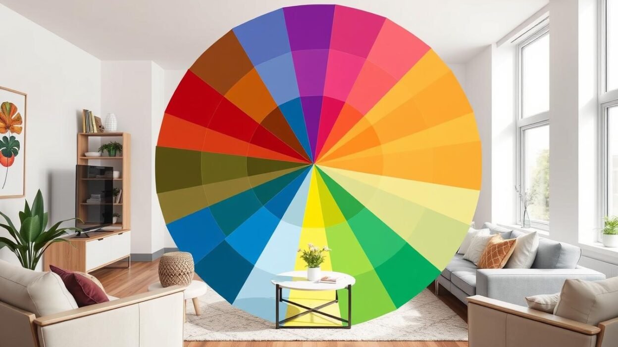
The Color Wheel: A Designer’s Best Friend
The color wheel is vital in interior design. It shows how colors relate to each other. This helps designers create balanced, pleasing color schemes.
Understanding the wheel helps you choose colors that work well together in your home.
Emotional Impact of Colors
Colors can change how we feel in a room. Warm tones like red and orange create cozy, energetic spaces. Cool blues and greens promote calm and relaxation.
Think about the mood you want in each room when choosing colors.
“Color is a power which directly influences the soul.” – Wassily Kandinsky
Knowing these color basics will help you make smart design choices. You can create stunning, emotionally powerful living spaces that you’ll love.
The Psychology of Color in Home Settings
Color psychology shapes our living spaces. The hues we pick affect our mood and productivity. Smart color choices create harmonious and functional home environments.
How Colors Affect Mood and Atmosphere
Colors trigger various emotions and reactions. Warm reds and oranges energize, while cool blues and greens relax. Neutral shades offer balance in room design.
Strategic color use can shape a room’s atmosphere. This helps tailor each space to its intended purpose.
Choosing Colors for Different Rooms
Consider a room’s function when picking colors. Match the hues to the desired ambiance.
- Living rooms: Warm, inviting colors to encourage socializing
- Bedrooms: Soothing, restful hues for relaxation
- Home offices: Stimulating colors to boost productivity
- Kitchens: Appetizing shades that complement food
Seasonal Color Influences
Seasons can sway our color choices in interior design. Light colors suit spring and summer. Rich, deep tones create coziness in fall and winter.
Use seasonal colors in accent pieces. This allows for easy updates to your home’s atmosphere.
“Color is a power which directly influences the soul.” – Wassily Kandinsky
Color psychology enhances room design. It creates beautiful spaces that support our well-being. This approach optimizes our homes for daily living.
Popular Color Schemes and Their Uses
Color schemes are crucial in Family and Consumer Sciences, especially for interior design. They can transform living spaces into stunning environments. Let’s explore popular color combinations and their home decor applications.
Monochromatic Color Palettes
Monochromatic schemes use various shades and tints of a single color. This approach creates a harmonious and sophisticated look. A bedroom might feature light blue walls, navy curtains, and sky blue bedding.
Complementary and Analogous Colors
Complementary colors sit opposite each other on the color wheel, creating bold contrasts. Analogous colors are next to each other, offering a subtle blend. A living room could pair orange and blue accents for contrast.
Alternatively, it might use green and yellow for a more harmonious feel. Both options can create unique and appealing spaces.
Triadic Color Schemes
Triadic schemes use three colors evenly spaced on the color wheel. This creates a vibrant and balanced look. A kitchen might combine yellow cabinets, red appliances, and blue backsplash tiles.
| Color Scheme | Characteristics | Best Used In |
|---|---|---|
| Monochromatic | Harmonious, sophisticated | Bedrooms, offices |
| Complementary | Bold, high-contrast | Living rooms, dining areas |
| Analogous | Subtle, natural | Bathrooms, sunrooms |
| Triadic | Vibrant, balanced | Kitchens, playrooms |
The right color scheme can dramatically change a room’s atmosphere. Try different combinations to create unique palettes. Your choices will reflect your style and enhance your living space.
Transforming Spaces with Color
Color is a powerful tool in Domestic Science for Space Transformation. It can dramatically change how a room feels. Color Application is crucial in interior design.
Enhancing Small Rooms with Light Colors
Light hues make compact spaces feel bigger. They reflect light, creating an illusion of openness. Soft whites, creamy beiges, and light grays work well for small rooms.
- Paint ceilings a shade lighter than walls to raise perceived height
- Use glossy finishes to bounce light around the room
- Incorporate mirrors to amplify light and create depth
Darker Shades for Coziness and Drama
Dark colors can be transformative in interior design. They create intimacy and warmth, ideal for bedrooms or living areas. Rich navy, forest green, or charcoal gray add sophistication to a space.
| Color | Effect | Best Used In |
|---|---|---|
| Navy Blue | Calming, elegant | Bedrooms, studies |
| Forest Green | Natural, grounding | Living rooms, dining areas |
| Charcoal Gray | Sophisticated, modern | Home offices, entertainment rooms |
Successful Color Application balances light and dark shades. This contrast creates visual interest in a space. It defines different areas, showing color’s transformative power in Domestic Science.
Exterior Color Choices: Making the Right Impression
Exterior design creates curb appeal and sets the tone for your home. The colors you choose impact its overall look and feel. Let’s explore how to pick the right colors for your home’s exterior.
Curb Appeal and Neighborhood Harmony
Consider curb appeal and how your home fits into the neighborhood. A good color scheme can boost your home’s value and create a welcoming atmosphere.
Take inspiration from your surroundings and choose colors that complement neighboring houses. Make sure to reflect your personal style too.
Seasonal Considerations for Exteriors
Think about how your chosen colors will look throughout the year. Bright colors might pop in summer but appear harsh in winter. Neutral tones often work well year-round, providing a timeless look.
Use accent colors on doors or shutters to add visual interest. This can enhance the design without overwhelming it.
Home Ec principles can guide your exterior color choices. Light colors can make a house appear larger. Darker shades can create a cozy, intimate feel.
Balance is key in exterior design. Aim for a harmonious blend of colors. This enhances your home’s architectural features and creates lasting curb appeal.
Color Trends in Modern Interior Design
Modern interior design is shifting towards Sustainable Design practices. This shift influences Color Trends in exciting ways. It shows a growing concern for the environment and healthier living spaces.
Eco-Friendly Paints and Sustainable Options
Eco-friendly paints are becoming more popular in home decor. These products have low or zero volatile organic compounds (VOCs). They’re safer for people and the planet.
Sustainable options go beyond paint. They include natural dyes and recycled materials in textiles and furnishings.
Trending Colors for 2023
Nature-inspired hues are surging in 2023. Earthy greens, warm terracottas, and soft blues lead the palette. These colors create calm and connect us to the outdoors.
They support Nutrition and Wellness goals. They reduce stress and promote relaxation in living spaces.
Balancing Bold Colors with Neutrals
Bold colors make a statement. But balancing them with neutrals is key for harmonious interiors. Designers pair vibrant accent walls with neutral furnishings.
They also use pops of color in muted rooms. This allows for personal expression while keeping a serene atmosphere.
| Bold Color | Neutral Pairing | Effect |
|---|---|---|
| Emerald Green | Cream | Natural Elegance |
| Coral | Gray | Energetic Balance |
| Navy Blue | Beige | Timeless Sophistication |
These Color Trends and Sustainable Design practices create appealing spaces. They support overall Nutrition and Wellness. Homeowners can use them to make beautiful, healthy homes.
Accent Colors and Their Role
Accent colors are vital in interior design. They add depth and character to spaces. These colors can transform ordinary rooms into captivating environments.
Using Accents to Create Focal Points
Focal points are key elements in interior design. They draw the eye and create visual anchors. Accent colors are powerful tools for establishing these focal points.
A bold accent wall or vibrant artwork can become the center of attention. These elements guide the eye through the space, creating balance and harmony.
In a neutral living room, a bright yellow armchair can be striking. This pop of color adds visual interest. It also helps guide the eye through the space.
Tips for Choosing Accent Colors
Selecting the right accent colors is crucial for successful interior design. Here are some tips to help you choose:
- Consider the existing color palette in your space
- Use the color wheel to find complementary or contrasting hues
- Test samples in different lighting conditions before committing
- Start small with accent pieces like throw pillows or vases
- Don’t be afraid to experiment with unexpected color combinations
Accent colors should enhance your space, not overwhelm it. Aim for a cohesive look that reflects your style. This approach will add visual interest to your home.
The Role of Texture in Color Perception
Texture greatly affects how we see colors in interior spaces. It shapes our visual and tactile experiences in Textile and Apparel Design. This interplay between texture and color is key to creating engaging environments.
How Different Materials Affect Color
Materials can drastically change Color Perception. Rough surfaces scatter light, making colors less intense. Smooth surfaces reflect light, enhancing color vibrancy.
Texture in Design uses this principle to create depth and interest. Designers carefully choose materials to achieve desired color effects.
| Material | Effect on Color | Design Application |
|---|---|---|
| Velvet | Deepens colors | Luxurious accent pieces |
| Silk | Enhances sheen | Elegant draperies |
| Linen | Softens hues | Casual upholstery |
Layering Textures for Visual Interest
Layering textures is crucial in Textile and Apparel Design. It adds depth and dimension to spaces. Combining smooth and rough textures can highlight color contrasts.
“Texture is to color what seasoning is to food – it enhances the experience.”
Understanding texture and Color Perception helps create engaging spaces. This knowledge is vital in Texture in Design. It allows for rich, multi-dimensional interiors that inspire.
Color Beyond Paint: Other Applications
Color shapes our homes in many ways, not just through wall paint. Furniture and textiles also play crucial roles in setting the mood.
Furniture and Accessories
Furniture design is key to creating a unified color scheme. Bold-colored sofas can be eye-catching centerpieces. Neutral pieces offer flexibility.
Accessories like throw pillows and artwork add color splashes without long-term commitment. These small touches can transform a room’s look.
Fabrics and Textiles
Textile selection greatly influences interior design. Curtains, rugs, and upholstery contribute heavily to a room’s overall palette. Mixing textures and patterns adds depth and visual interest.
| Textile | Impact on Room | Color Consideration |
|---|---|---|
| Curtains | Frame windows, control light | Can be bold or subtle |
| Rugs | Define spaces, add warmth | Often used as a base for color scheme |
| Upholstery | Adds comfort and style | Can be changed seasonally |
Thoughtful color choices in furniture and textiles create inviting spaces. These elements reflect your personal style and enhance your home’s atmosphere.
Creating a Cohesive Color Story
Color coordination transforms living spaces and creates seamless interior flow. A well-planned color story can elevate your home’s aesthetic. Let’s explore how to develop a unified palette and transition colors between rooms.
Developing a Unified Color Palette
Start by selecting a base color that reflects your style. Build your palette around this hue, adding complementary and accent colors. Use the 60-30-10 rule for balance.
Apply your main color to 60% of the space. Use a secondary color for 30% and an accent color for 10%.
Transitioning Colors Between Rooms
Smooth color transitions enhance interior flow. Use these techniques to create a harmonious progression:
- Gradual shift: Move from light to dark shades of the same color family
- Common thread: Repeat a color or pattern in different rooms
- Neutral bridges: Use neutral tones in connecting spaces like hallways
| Room | Main Color | Accent Color | Transitional Element |
|---|---|---|---|
| Living Room | Sage Green | Terracotta | Wood Tones |
| Kitchen | Cream | Sage Green | Terracotta Tiles |
| Bedroom | Soft Blue | Cream | Sage Green Throw |
These color coordination principles create a unified and appealing home. Your living space will reflect your style and enhance your daily experience.
DIY Tips for Color Application
Adding color to your home can be simple and affordable. You can transform your space with easy DIY interior design techniques. Let’s explore some practical tips for applying color at home.
Techniques for Painting and Finishing
Preparation is crucial for painting. Clean walls, fill holes, and use tape for clean edges. Apply thin coats and let each layer dry completely.
For added texture, try color washing or sponging techniques. These methods can give your walls depth and visual interest.
Exploring Color with Wall Decals and Art
Wall decals and art offer easy ways to add color. Removable decals come in various designs and brighten rooms instantly.
Create a gallery wall with colorful prints or paintings. This showcases your style without needing to paint.
Color application isn’t just for walls. Paint furniture or add colorful throw pillows to refresh your space. These DIY tips will help bring your color vision to life.
FAQ
What is the importance of color theory in interior design?
Color theory is vital in interior design. It helps create balanced color schemes that evoke emotions. Designers use it to alter room perception and create cohesive aesthetics.
How do colors affect mood in different rooms?
Colors greatly influence mood in various rooms. Blue tones promote calmness in bedrooms. Yellow stimulates energy in home offices. Red may increase appetite in dining areas.
What are some popular color schemes used in interior design?
Popular color schemes include monochromatic, complementary, analogous, and triadic. Each scheme offers unique aesthetic effects. They can be tailored to suit different design styles.
How can I use color to make a small room appear larger?
Use light colors on walls and ceilings to make a small room look bigger. These colors reflect more light, creating an illusion of space. A monochromatic color scheme can enhance the perception of size.
What are some eco-friendly paint options for interior design?
Eco-friendly paints include low-VOC and zero-VOC options. These emit fewer harmful chemicals. Other choices are milk paint, clay paint, and plant-based paints. They improve indoor air quality and benefit the environment.
How do I choose the right accent colors for my room?
Consider your room’s existing palette when choosing accent colors. Select colors that complement or contrast with it. Accent colors should make up 10-15% of the room’s scheme. Introduce them through accessories, artwork, or a feature wall.
How does texture affect color perception in interior design?
Texture influences how we perceive color in interior design. Rough textures make colors appear darker and muted. Smooth textures make colors look brighter and vibrant. Layering textures adds depth to a color scheme.
What are some tips for creating a cohesive color story throughout a home?
Start by selecting a main color palette reflecting your style. Use this palette as a guide for each room. Vary the intensity and proportion of colors. Use transitional colors in connecting spaces like hallways.
Repeat key colors in different rooms through accessories or accents. This maintains visual flow and unity throughout the home.
How can I incorporate color trends without making my space look dated quickly?
Use trendy colors in easily changeable elements like pillows or rugs. Keep larger features like walls and furniture neutral. This allows you to update your space while maintaining a timeless foundation.
What are some DIY techniques for applying color in home interiors?
DIY color techniques include ombre effects, color blocking, and stenciling. Consider using removable wallpaper or wall decals for less permanent options. Properly prepare surfaces and use quality tools for best results.