Introduction
In the realm of education, the ability to interpret data effectively has become increasingly crucial for aspiring educators and researchers. The UGC NET Paper 1 is a pivotal examination for anyone looking to make their mark in academia in India. Within this paper, data representation through tables and graphs is not merely an essential skill; it’s a gateway for deeper insights and stronger responses.
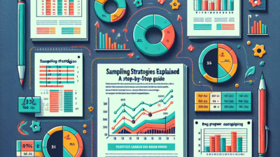
In this ultimate guide, we will explore how to adeptly handle tables and graphs in UGC NET Paper 1, converting raw data into actionable insights. By the end of this article, you will possess the tools to analyze, interpret, and present data confidently, ultimately improving your overall exam performance.
Understanding the Basics of Data Representation
1. What Are Tables?
Tables serve as a structured way to organize data. They arrange values in rows and columns, making complex information more comprehensible at a glance. Here’s why tables are crucial:
- Clarity: Tables present data in an organized format that makes it easier to read and comprehend at a glance.
- Comparison: They facilitate instantaneous comparison across multiple variables.
2. What Are Graphs?
Graphs, on the other hand, visually represent data points, unveiling trends and relationships that might be obscured in table format. Common types of graphs include:
- Bar Charts: Useful for comparing quantities across different categories.
- Line Graphs: Excellent for illustrating data trends over time.
- Pie Charts: Effective for showing parts of a whole.
Analyzing Tables and Graphs: Step-by-Step Breakdown
Step 1: Identify the Purpose
Before you dive into the details, take a moment to understand the purpose of the given table or graph. Is it meant to compare data, show time trends, or illustrate proportions? Knowing the purpose helps streamline your analysis.
Step 2: Read the Labels
Look closely at the titles, axes, and legends. They provide critical context for interpreting the data accurately. Missing these could lead to misinformation!
Step 3: Look for Trends or Patterns
While analyzing graphs, pay special attention to rising or falling trends. For tables, compare values across columns and rows to gather insights.
Step 4: Be Mindful of Data Presentation
Data can be manipulated through scale and representation choice. Be wary of:
- Scale Manipulation: A graph can mislead if the scale is adjusted improperly.
- Data Omission: Important data points may be excluded, potentially skewing interpretation.
Step 5: Summary of Insights
Once you’ve analyzed the data, summarize your findings. Ask yourself what key insights can be drawn and how they relate to the broader context of the question or topic.
Example Analysis: A Table and Graph
Table Example: Population Growth by Year
| Year | Population (millions) |
|---|---|
| 2010 | 121 |
| 2015 | 128 |
| 2020 | 136 |
| 2025 | 144 |
- Identify Patterns: Notice the steady increase.
- Key Insight: The population is predicted to grow at a consistent rate.
Graph Example: Population Growth Over Time

- Trend Analysis: The graph confirms the table’s findings – consistent growth illustrating the upward trend.
- Critical Insight: Such growth has implications for resource management and urban planning.
Translating Insights to Answers: Strategies for UGC NET Paper 1
1. Make Connections
Link the insights gleaned from tables and graphs to the core topics of your exam paper. For instance, if asked about demographic changes, frame your responses in the context of the data presented.
2. Use Clear, Concise Language
When framing answers, prioritize clarity. Avoid jargon and write in a straightforward manner to enhance comprehension.
3. Support Claims with Data
Always back up your assertions with relevant data from the table or graph. For example, “As indicated by the table, the population is expected to grow by 8 million from 2020 to 2025.”
4. Relate to Real-World Contexts
Contextualizing your data interpretation enhances its relevance. Discuss how trends in population growth may influence policy decisions in education or healthcare.
Advanced Examples for Practice
Example 1: Analyzing Job Growth Data
| Year | Job Growth (%) |
|---|---|
| 2018 | 2.5 |
| 2019 | 3.0 |
| 2020 | -1.0 |
| 2021 | 4.5 |
- Analysis: Observe that while the job growth was strong in 2018 and 2019, a dip occurred in 2020 likely due to external factors like the pandemic.
Example 2: Visual Interpretation with Pie Charts
- Breakdown: This chart shows job growth by industry sector. IT accounts for the largest share, emphasizing the sector’s resilience in economic downturns.
Step-by-Step Exercise
- Analyze the given table and graph at your convenience.
- Identify key insights and summarize them in a paragraph.
- Consider implications of the data in real-world scenarios.
Practical Tips for Mastery
- Practice with Variety: Engage with different types of data presentations to strengthen your skills.
- Time Management: During the exam, allocate specific time limits for tables and graphs to ensure comprehensive coverage.
- Resources: Use supplementary materials such as UGC guidelines, past papers, and online tutorials to reinforce learning.
Conclusion
Mastering the ability to interpret tables and graphs enhances your understanding and performance in UGC NET Paper 1. Consider this skill not merely as a technical requirement but as a critical tool for academic inquiry.
As you continue to prepare, remember that data represents real-world phenomena that can lead to insightful conclusions. Embrace the challenge, and transform raw data into compelling narratives that resonate with your audience.
Now that you have the tools and strategies to tackle tables and graphs, step forward with confidence into your UGC NET Paper 1 journey!
FAQs
1. What type of graphs are commonly used in UGC NET Paper 1?
Answer: Bar charts, line graphs, and pie charts are commonly used to portray different types of data.
2. How can I practice my data analysis skills?
Answer: Use past examination papers, online quizzes, and data interpretation exercises available on educational websites.
3. What common mistakes should I avoid?
Answer: Avoid ignoring labels, misinterpreting scales, and lacking context in your interpretations.
4. Is there a systematic approach to answering questions related to data?
Answer: Yes! Always identify the purpose, read labels, look for patterns, summarize insights, and support your claims with data.
5. How can I improve my time management during the exam?
Answer: Practice simulating exam conditions, set timers for each section of the exam, and focus on efficiency without sacrificing depth.
This comprehensive guide is designed to empower you as you embark on your preparation journey. Dive into the world of data interpretation, and let your insights shine! 🌟