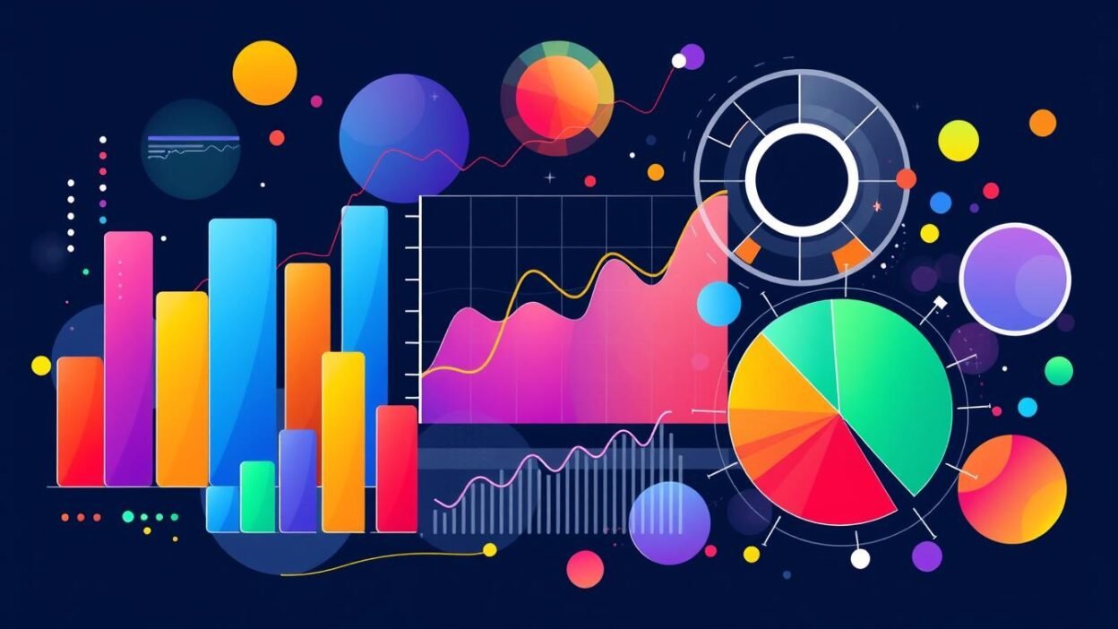
Data interpretation starts with numbers, but what if those numbers tell a story? Data visualization turns numbers into insights we can use. It helps us make better decisions. Our brains understand visual patterns much faster than text.
This article looks at how tools like bar graphs and line charts help us understand complex data. We’ll see why visuals are key in finding hidden trends. You’ll learn how to choose the right tools, like Excel or Tableau, for your data and audience.
Key Takeaways
- Visual representations accelerate cognitive processing of data by 60,000% compared to text.
- Data visualization techniques like line charts and pie graphs simplify pattern recognition.
- Effective data analysis requires aligning visualization methods with specific analytical objectives.
- Human visual perception prioritizes spatial relationships over numerical values for rapid comprehension.
- Tools such as Tableau and Excel provide structured pathways for transforming raw data into strategic narratives.
Understanding the Importance of Data Interpretation
Data interpretation turns raw numbers into useful insights. Without it, data analysis is just numbers. This part shows how interpretation is key to making data useful for action.
Why Data Interpretation Matters
Good interpretation finds hidden trends and checks research. For example, a 2023 study in Nature showed how it cut down on wrong diagnoses by 34%. It connects data collection with making smart decisions, making sure analysis meets real needs.
Common Misconceptions
Many people get data wrong because they don’t analyze it well. Here are some big mistakes to avoid:
- Correlation ≠ Causation: Just because two things go up together, it doesn’t mean one causes the other. For example, ice cream sales and drowning might go up when it’s hot, but it’s the heat that’s the real cause.
- Overemphasis on Statistical Significance: Even if a result is statistically significant, it might not be important in real life. For instance, a 0.5% increase in sales might not be worth noticing.
- Confirmation Bias: People might pick data that supports what they already think, leading to wrong conclusions.
| Misconception | Impact | Example |
|---|---|---|
| Ignoring outlier data | Skewed forecasts | Financial models excluding rare market crashes |
| Assuming all trends are linear | Poor predictions | Population growth models ignoring migration shifts |
By avoiding these mistakes, experts make sure their analysis helps make good decisions, not just confirm what they think.
Types of Data Visualization Techniques
Data visualization turns raw data into easy-to-understand insights. It’s key to know the basics. Each method is for specific needs, helping us draw conclusions from data. Here are some main techniques for different situations.
Bar Graphs and Their Use Cases
Bar graphs are great for comparing different groups. They show how big each group is. Clustered bars show two or more datasets side by side. Stacked bars show how each part of a whole contributes.
It’s best to keep categories to 8-10. Also, use colors wisely to keep things clear.
- Use for: Sales comparisons, demographic splits, or survey results
- Avoid: Overcrowding bars with excessive categories
Line Charts for Trend Analysis
Line charts are perfect for showing trends over time. They help spot patterns or oddities. Smooth lines help with noisy data, and comparing multiple lines shows trends side by side.
They’re great for seeing seasonal changes in fields like economics or climate science.
Pie Charts: When to Use Them
Pie charts are good for showing how big each part of a whole is. But, they should be used carefully. They work best with 3-7 parts.
Using them for too many parts can mess up the picture. This can make data analysis less clear.
“A pie chart should never replace detailed data tables for complex relationships,” warns Dr. Anika Sharma, data science professor at IIT Bombay.
Choosing the right method makes sure our visualizations meet our goals. This helps us understand data better and share it with others.
Choosing the Right Visualization Tool
Choosing the right tool for data visualization is key. It must match your project goals and fit your technical setup. Good data analytics tools handle data processing well. They should also be easy to use and grow with your needs.
Popular Visualization Tools Overview
Each leading platform has its own strengths:
- Tableau: Offers easy drag-and-drop tools for quick data visualization. It’s great for business users who need dashboards fast.
- Power BI: Works well with Microsoft tools, giving top security and cloud growth for big data processing tasks.
- Python’s Matplotlib/Seaborn: These open-source libraries are perfect for developers. They let you customize your data analytics workflow.
- R’s ggplot2: It’s all about stats, making it a top choice for researchers working with complex data.
Factors to Consider When Choosing a Tool
When picking a tool, think about these:
- Data Volume: Some tools, like Tableau, can handle huge amounts of data. But smaller tools might get overwhelmed.
- Audience Proficiency: Simple interfaces are best for non-tech teams. But analysts often prefer coding.
- Integration Capabilities
- : Make sure the tool works with your databases (like SQL or NoSQL) and cloud services (like AWS).
- Cost Constraints
- : Free tools save money upfront but might need more tech know-how.
By choosing wisely, you avoid big mistakes in data visualization. This ensures your tool fits your needs perfectly.
Effective Data Storytelling
Data interpretation and visualization are more than just technical skills. They are ways to share information. A good story turns raw data into useful insights by matching visuals with what people expect. This mix of numbers and stories makes messages hit home both intellectually and emotionally.
Crafting a Narrative with Visuals
Good storytelling starts with clear structure. Stories often use certain patterns like:
- Problem-Solution: Showing the gap between what we have and what we want
- Temporal Progression: Visuals that show how things change over time
- Comparative Analysis: Comparing things side by side to highlight differences or connections
“Visual stories work best when they show patterns that words can’t,” says cognitive psychologist Eleanor Rosch. She points out how seeing things helps us remember them better.
Engaging Your Audience with Data
Getting people to care about your data is key. It’s all about designing with your audience in mind:
- Attention Anchors: Start with striking visuals to grab attention right away
- Layered Complexity: Show more details as you go, matching the audience’s level of understanding
- Interactive Elements: Add features like tooltips or drill-downs to encourage people to explore
Understanding your audience through qualitative analysis is vital. By aligning visuals with what people care about, you can lead them through a story without overwhelming them. This approach makes data a bridge between the person sharing it and those listening.
Analyzing Trends through Data Visualization
Data visualization turns raw data into useful insights by showing hidden patterns. This part looks at how data analysis and statistical analysis find patterns important for making smart decisions.
Identifying Patterns and Anomalies
Spotting patterns is key in trend analysis. Data mining helps find:
- Clustering: Grouping similar data points (e.g., customer segments)
- Cyclical trends: Seasonal sales changes or regular market behaviors
- Correlation mapping: Showing how variables like temperature and energy demand are linked
Finding anomalies combines algorithms (like outlier detection in Python’s Scikit-learn) with looking at the data. For example, sudden spikes in health data might show new public health issues that need quick action.
Making Predictions Based on Trends
Predictive modeling connects what we see now with what might happen later. Analysts use:
- Extrapolation: Predicting future trends based on current ones
- Confidence intervals: Showing the range of possible outcomes in economic forecasts
- Scenario modeling
- : Testing how different policies might affect outcomes
“Predictive accuracy depends on thorough statistical analysis of sample representativeness and variable independence,” says Dr. Rajesh Varma, data science lead at Analytics India Magazine.
It’s important to consider outside factors (like the economy) to keep predictions realistic.
Utilizing Software for Data Interpretation
Data processing and analysis need the right tools. Excel and Tableau are key, each with its own strengths.
Overview of Excel for Data Analysis
Excel is a top choice for data processing. It has features like pivot tables and conditional formatting. These help spot trends easily.
Its formula-based system makes data analysis simpler. It handles everything from simple math to complex stats. Key features include:
- Pivot tables for summarizing large datasets
- Data validation to keep data accurate
- Dynamic charts for easy visuals
But, Excel might struggle with huge amounts of data or complex data visualization.
Introduction to Tableau for Advanced Visualization
Tableau is great for turning data into interactive visuals. Its easy-to-use interface lets you make dashboards fast. It’s perfect for exploring data in real-time. Key strengths include:
- Advanced data visualization with heat maps and geospatial layers
- Live data connections for updates on the fly
- Parameter controls for user-driven analysis
Tableau is great for big teams needing to work together on data analysis.
“Excel handles structured workflows, while Tableau democratizes complex insights through visualization.” — Gartner Analytics Report (2023)
Choosing between Excel and Tableau depends on your project. Excel is good for small data processing tasks. Tableau is best for big data visualization projects. Both are vital for today’s analytical work.
Best Practices for Data Interpretation
Data interpretation needs to be precise to show real results. Using methods like quantitative data analysis and statistical analysis helps avoid mistakes. This ensures the results are trustworthy. Here, we discuss how to keep analysis accurate and avoid misleading visuals.
Ensuring Accuracy in Data
Starting with accurate data is key. Statistical analysis helps spot outliers. For example, z-scores or IQR can highlight unusual data points.
Missing data must be handled carefully. Use mean or median to fill gaps or mark them clearly. This prevents wrong conclusions. Also, check data sources often to keep them reliable. Bad data can ruin even the best visual tools like Excel or Tableau.
Avoiding Common Pitfalls in Visualization
Good visuals don’t trick the eye. Here are important steps:
- Scale consistency: Start y-axes at zero to show trends correctly.
- Color psychology: Use bright colors wisely; they can make data seem more important than it is.
- Contextual labels: Make sure axis and legend labels are clear to avoid confusion.
“Visual perception biases often override logical analysis—designers must counteract this through transparency.” — Dr. R. Rajaraman, Cognitive Data Scientist at IIT Madras
Combining careful methods with understanding of how we see things ensures accurate interpretations. This way, analysts can share findings that match both data and how our brains work.
Real-World Applications of Data Visualization
Data visualization turns complex data into clear insights. It uses data analytics and qualitative data analysis to help professionals make better decisions. Here are some examples of how it works in real life.
Case Studies: Successful Data Interpretations
- Healthcare Outcomes: Apollo Hospitals tracks patient mortality rates in real-time. They use heatmaps to spot high-risk areas, helping them focus on those areas.
- Financial Markets: Fidelity Investments uses data visualization tools like Tableau to track stock market changes. They use trend lines to find the best times to buy or sell.
- Public Policy Impact: India’s National Health Mission combines surveys with data to see vaccination coverage. They use heatmaps to show where to focus on vaccinations.
- Manufacturing Efficiency: Tata Steel uses diagrams to find production bottlenecks. They color-code timelines to show where to cut waste, cutting waste by 18% in 2023.
Industries That Benefit from Visualization
Many sectors use these techniques to improve:
- Healthcare: They make patient care better by showing how it works.
- Finance: They use data visualization to manage risks in investments.
- Manufacturing: They predict when machines need maintenance with real-time data.
- Public Sector: They assess policy effects with geospatial data.
“Visual evidence reduces decision-making friction by 40% in cross-functional teams.” — 2024 MIT Sloan Management Review
These examples show how data analytics fits different needs. By turning data into stories, companies gain a strategic edge.
The Role of Interactivity in Data Visualization
Interactivity in data visualization lets users dive into datasets in a hands-on way. It turns looking at data into a chance to really dig into it. This makes data processing better. It’s about making theory meet real-world data analytics use.
Benefits of Interactive Visuals
Interactive features open up new ways to analyze data:
- Drill-down navigation: Users can explore data layers to find deeper connections.
- Filtering systems: Users can adjust data in real-time for focused analysis.
- Scenario modeling: Tools like sliders let users see how data changes under different scenarios.
Tools for Creating Interactive Charts
Choosing the right tool depends on your skills and the project’s needs. Here are some top picks:
| Tool | Key Features | Best Use Cases |
|---|---|---|
| Tableau | Drag-and-drop interface, real-time data linking | Corporate dashboards, market trend analysis |
| Highcharts | JavaScript-based customization, cross-platform compatibility | Web-based data visualization projects |
| R Shiny | Statistical integration, reproducible workflows | Academic research, hypothesis testing |
Developers face a choice between ease of use and coding complexity. For example, Python Dash needs coding skills but offers native Python interactivity. On the other hand, Power BI is easy to use but best for big teams. The right tool makes sure everyone can dive into the data effectively.
Ethical Considerations in Data Visualization
Data interpretation and processing need careful ethical review. It’s important to protect privacy, ensure accuracy, and be transparent. This way, data mining and visuals meet legal and social standards.
Data Privacy and Security
Keeping sensitive data safe is a top priority. Techniques like anonymization and aggregation help protect identities. Also, using strong access controls and encryption keeps data secure.
Rules like GDPR in the EU, HIPAA in the US, and India’s PDPA are key. They ensure data visualization projects handle personal or health data correctly.
“Ethics in visualization is not an afterthought—it’s the foundation of trustworthy data communication.”
Misleading Visuals and Their Impact
Visuals can be misleading. Common mistakes include:
- Truncated axes exaggerating trends
- 3D charts distorting proportions
- Selective data omission
A 2023 study by the Indian Statistical Institute found a big problem. 45% of public health reports in India used misleading charts. This can harm public trust and policy decisions.
| Issue | Example | Ethical Solution |
|---|---|---|
| Data privacy breach | Visualizing raw patient records | Aggregate data to anonymize identities |
| Distorted visuals | Exaggerated bar chart scales | Standardize axis ranges and disclose methodology |
| Bias in selection | Ignoring outlier data points | Full dataset transparency in footnotes |
Following ethical guidelines is key. It makes sure data interpretation helps society without losing integrity. It’s important to apply these principles at every step of visualization design.
Future Trends in Data Visualization
Data visualization is changing fast, thanks to new data mining and analytics tools. Professionals need to learn new methods while keeping communication clear.
The Evolution of Visualization Tools
Tools like Excel started with simple charts. Now, platforms like Tableau offer interactive dashboards with real-time data. We’re moving from 2D graphs to immersive experiences with AR and VR.
These tools work with data mining to find patterns quickly. This means we get insights faster.
Predictions for the Next Decade
Future trends will focus on making tools easier to use and more interactive. AI might help understand data, and voice commands could make tools simpler. But, we’ll face challenges like too much information and making sure tools work the same way everywhere.
We also need to make sure AI is fair and protects our data. Combining data visualization with machine learning could make analysis easier for everyone. But, making sure everyone has access to these tools is key to avoiding a divide.
As technology keeps improving, keeping things clear and accurate will always be important. It will guide professionals in this changing world.
FAQ
What is the significance of data visualization in data analysis?
Data visualization is key in data analysis. It turns complex data into easy-to-understand visuals. This helps analysts spot patterns and trends better than looking at raw data alone.
Using visual tools makes insights clearer. This improves decision-making in many fields.
How does data interpretation differ from data analysis?
Data interpretation is about making sense of data and drawing conclusions. It needs a deep understanding of the data’s context. Data analysis, on the other hand, focuses on the numbers, using stats to find insights.
The two are closely linked. Good data analysis is needed for accurate interpretation.
What are some common missteps in data visualization?
Common mistakes include using misleading scales and wrong chart types. Not thinking about the audience is also a mistake. For example, pie charts with many categories confuse viewers.
Truncated axes can also distort data. These errors can lead to wrong conclusions.
Which tools are best for data visualization?
There are many tools for data visualization, from Tableau and Power BI to D3.js and Python libraries. Choose based on data size, needed interactivity, and user skill. The right tool helps meet your analysis goals.
How can interactive visuals enhance data storytelling?
Interactive visuals let users explore data themselves. This makes data more personal and memorable. It turns data storytelling into a team effort, creating a stronger connection to the insights.
What ethical considerations should be accounted for in data visualization?
When visualizing data, protect privacy and security, and avoid misleading visuals. Always present data clearly and accurately. Follow ethical standards and respect laws.
What future trends are emerging in data visualization?
Future trends include augmented reality, AI, and more interactivity. These changes aim to make analysis easier for everyone. As technology evolves, so must our skills to keep up.