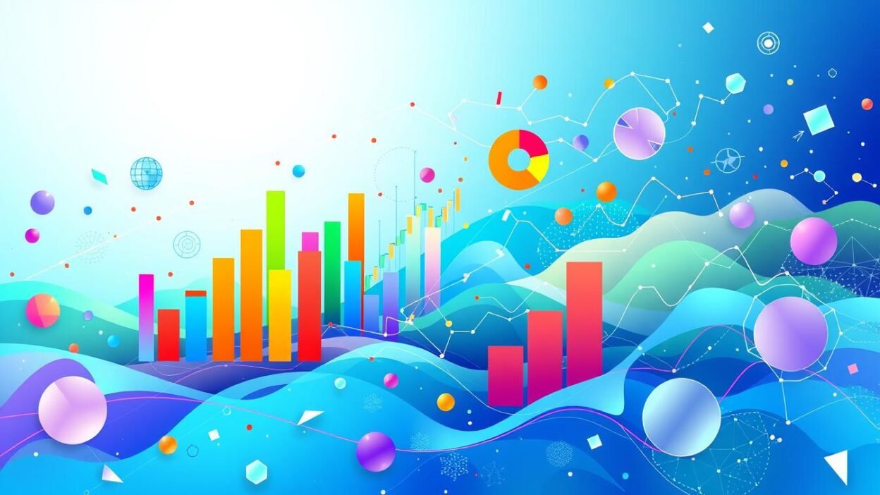
The human brain processes visual information 60,000 times faster than text. This fact highlights the importance of data visualization in research. For UGC NET Paper 1, graphical representation of complex data is crucial.
Data visualization is more than just making things look pretty. It’s a key part of research that helps unlock the potential of numbers. It turns abstract ideas into easy-to-understand visuals.
This approach allows people to spot patterns and trends quickly. It leads to better conclusions and more informed decisions. Researchers, students, and professionals can all benefit from this skill.
Key Takeaways
- Data visualization processes 60,000 times faster than text in the human brain.
- Graphical representation is a critical component of research methodology and data analysis.
- Effective data visualization enables the identification of patterns, trends, and outliers in complex information.
- Mastering data visualization techniques is essential for success in UGC NET Paper 1 examinations.
- Graphical representation transforms abstract data into actionable insights for informed decision-making.
Understanding the Fundamentals of Data Visualization in Research Methodology
Data visualization is key in research methodology. It helps researchers share complex information clearly. This skill aids data interpretation and improves teaching ability.
Visual data representation comes in various forms. Each type has its own strengths and uses. Let’s explore these types and their applications.
Types of Visual Data Representation
Data can be shown visually in many ways. Here are some common types:
- Bar charts and histograms for comparing categorical data
- Line graphs for tracking trends over time
- Scatter plots for investigating relationships between variables
- Pie charts and donut charts for displaying part-to-whole relationships
- Infographics for combining text, images, and data to tell a story
Core Principles of Effective Data Display
Some key principles make data displays effective. These apply to all visualization techniques. Let’s look at these important guidelines.
- Clarity and Simplicity: Visualizations should be clear, uncluttered, and easy to interpret.
- Appropriate Scaling and Labeling: Axes, legends, and other labels should be clear and informative.
- Effective Use of Color: Colors should be used judiciously to highlight important information and avoid visual distractions.
- Consistent and Coherent Design: The visual elements should be cohesive and aligned with the overall messaging and context.
The Psychology Behind Visual Data Processing
Our brains excel at processing visual information. Research has revealed insights into visual perception. These findings help create better data visualizations.
- The tendency to quickly identify patterns and trends in visual data
- The ability to process and retain information more effectively when presented visually
- The importance of cognitive load and the need to optimize visualizations for easy comprehension
Understanding these principles helps researchers create effective visualizations. Good visuals support research methods, data interpretation, and teaching skills.
The Evolution of Graphical Representation in Teaching Aptitude
Visual aids in higher education have transformed over time. Once just a supplement, they now play a key role in teaching. These tools enhance communication between teachers and students.
In the past, chalkboards and overhead projectors were the main visual tools. Now, technology offers many more options. Educators can use interactive infographics, dynamic charts, and animations to explain complex ideas.
This shift to more engaging visuals is based on brain science. Our minds process visual information more easily. Visual aids can boost memory, critical thinking, and teamwork among students.
| Year | Graphical Representation in Teaching | Impact on Teaching Aptitude |
|---|---|---|
| 1950s | Chalkboards and overhead projectors | Limited interactivity and engagement |
| 1980s | Introduction of computer-generated slides | Increased visual appeal and flexibility |
| 2000s | Interactive whiteboards and multimedia presentations | Enhanced collaboration and student participation |
| 2020s | Augmented reality, virtual simulations, and data visualization tools | Immersive experiences and data-driven insights |
Advanced visual tools are now vital for effective teaching. They help teachers connect with students better. These tools foster deeper understanding and improve overall communication in higher education.
“The essence of effective teaching is the ability to translate complex ideas into accessible and engaging visual representations.”
Essential Components of Data Interpretation Through Visual Aids
Visual aids are key to effective data interpretation. They transform complex numbers into meaningful insights. These tools boost logical reasoning and improve communication.
Color Theory in Data Visualization
Strategic color use is vital in data visualization. Color theory helps highlight key points and guide attention. It can establish visual hierarchy and evoke specific emotions.
Complementary hues can emphasize relationships within data. Careful color selection enhances the overall impact of visualizations.
Layout and Design Principles
Layout and design are crucial for effective data communication. Principles like symmetry and balance create cohesive, pleasing presentations. Thoughtful element placement improves readability and guides data interpretation.
Interactive Elements in Modern Visualization
Interactive features are now common in digital data visualization. They let users engage with data and explore different aspects. Hover-over tooltips and filtering options empower users to uncover tailored insights.
Dynamic data manipulation enhances the overall data interpretation experience. It allows users to draw their own conclusions from the information.
| Component | Importance in Data Interpretation | Key Considerations |
|---|---|---|
| Color Theory | Highlights key data points, establishes visual hierarchy, and evokes emotional responses. | Complementary hues, color palettes, and psychological associations. |
| Layout and Design | Improves readability, guides the viewer’s attention, and creates a cohesive presentation. | Symmetry, balance, visual flow, and strategic placement of elements. |
| Interactive Elements | Empowers users to explore data, uncover insights, and tailor the visualization to their needs. | Hover-over tooltips, filtering options, and dynamic data manipulation. |
Mastering these visualization components elevates data communication. It helps researchers and professionals foster deeper logical reasoning. This enhances the overall data interpretation experience for their audience.
UGC NET Paper 1: Data Visualization Techniques and Applications
Data visualization is crucial for success in the UGC NET Paper 1 exam. It transforms complex statistics into easy-to-understand visual formats. This skill is vital for research methodology and data interpretation.
Effective visuals turn statistics into compelling formats. Bar charts, scatter plots, infographics, and interactive dashboards are key tools. These techniques help interpret and communicate research findings in UGC NET Paper 1.
Visualization deepens understanding of research methodology. It reveals patterns and trends in datasets. This helps draw insights and make informed decisions.
Aspiring candidates must know various visualization techniques. These skills help communicate research findings effectively. They also show a deep grasp of research methodology.
Balance is key in data visualization. Create visually appealing displays that clearly show data and its importance. This approach enhances performance in the UGC NET Paper 1 exam.
Enhancing Communication Through Visual Data Storytelling
Visual data storytelling is a powerful tool in our data-driven world. It combines data, narratives, and visual design to convey complex information. This approach captivates audiences and drives meaningful action.
Professionals can use this method to enhance communication and logical reasoning. It also improves teaching abilities by making information more accessible and engaging.
Narrative Structure in Data Presentation
Effective data storytelling relies on a well-crafted narrative structure. Skilled communicators weave data points into compelling stories that resonate with audiences. This approach helps contextualize information, making it more memorable and impactful.
Audience Engagement Strategies
- Identify the target audience and tailor the data visualization to their needs and preferences.
- Leverage interactive elements, such as hover-over tooltips and dynamic charts, to encourage audience engagement and exploration.
- Incorporate relevant visuals and metaphors that help the audience connect with the data on a deeper level.
Visual Hierarchy Methods
Organizing data in a visually coherent manner is crucial for effective communication. Visual hierarchy principles guide the audience’s attention to the most important information.
Techniques like strategic use of color, size, and placement create a clear visual flow. These methods enhance logical reasoning and the overall impact of data presentations.
“The most effective data visualizations are not simply pretty pictures, but rather carefully crafted stories that illuminate complex information and inspire action.”
Mastering visual data storytelling unlocks the power of communication and logical reasoning. It helps professionals drive meaningful change and promote deeper understanding of complex topics.
Implementing Logical Reasoning in Graph Design and Analysis
Data visualization requires technical skills and logical reasoning. Researchers must present information clearly for accurate interpretation. This section explores strategies to enhance visual data representations through logical reasoning.
Logical reasoning in graph design starts with identifying core data insights. Designers can select appropriate graph types by defining research objectives. This approach ensures visual aids effectively communicate data interpretation and research methodology.
Identifying the core insights helps convey data effectively. It allows designers to highlight key trends and patterns. This thoughtful approach supports data interpretation and research methodology.
- Assess the data structure and characteristics to determine the optimal visual representation. For example, scatter plots may be useful for illustrating correlations, while bar charts excel at comparing categorical data.
- Organize information hierarchically, drawing the viewer’s eye to the most critical data points and relationships. Effective use of color, labeling, and spacing can guide the audience’s logical reasoning process.
- Incorporate interactive elements, such as tooltips or filtering options, to allow readers to explore the data in a more dynamic, personalized manner. This promotes deeper engagement and understanding.
Blending logical reasoning with visual design creates powerful data interpretation tools. This combination of analytical thinking and creativity enhances data visualization. It unlocks the full potential of visual communication in research.
“The purpose of visualization is insight, not pictures.”
– Ben Shneiderman, computer scientist
Impact of Data Visualization on Higher Education System
Data visualization is changing higher education. It helps with assessments, tracking student performance, and supporting administrative decisions. Universities and colleges now use visual analytics to improve their operations.
Educational Assessment Visualization
Educators use data visualization to improve assessments. Dashboards and reports show student learning outcomes clearly. This helps teachers spot areas for improvement and adjust their methods.
Visual data helps make better decisions about teaching. It leads to improved curricula and personalized learning experiences for students.
Student Performance Tracking Methods
- Visualizing student attendance patterns and engagement levels can help administrators identify at-risk individuals and implement targeted intervention strategies.
- Interactive charts and graphs showcasing student progress across various subjects and semesters enable educators to track individual and class-wide performance trends.
- Predictive analytics, powered by data visualization, can forecast student outcomes and guide academic advisors in providing timely support and guidance.
Administrative Decision Support Tools
Data visualization helps higher education administrators make better decisions. Interactive dashboards show key performance indicators, budget allocations, and resource use. These insights help leaders improve school operations.
With visual data, administrators can use resources more effectively. They can also align priorities with the changing needs of higher education.
| Metric | 2020 | 2021 | 2022 |
|---|---|---|---|
| Enrollment Rates | 85% | 88% | 92% |
| Graduation Rates | 78% | 82% | 85% |
| Student Satisfaction | 82% | 85% | 88% |
Data visualization greatly impacts higher education. It helps educators, administrators, and students make better choices. This leads to improved academic performance and continuous growth in education.
Current Affairs and Data Visualization: Modern Applications
Our world today is driven by information. Data visualization helps us understand complex current affairs better. It turns raw data into eye-catching visuals, making it easier to grasp important information.
Data visualization is changing how we share vital news. Infographics and interactive charts are now crucial for journalists and researchers. These tools help break language barriers and cultural differences.
Visual data is also improving public engagement. Governments and organizations use it to boost transparency and involve citizens. This new focus on data storytelling has changed how we handle current affairs.
| Current Affairs Domain | Data Visualization Applications |
|---|---|
| Politics and Governance |
|
| Economy and Finance |
|
| Social and Environmental Issues |
|
Data visualization in current affairs keeps evolving. Professionals must stay updated on the latest trends. By using visual communication, they can engage audiences and drive positive change.
Tools and Technologies for Advanced Data Visualization
Data visualization tools transform raw information into meaningful insights. These tools are revolutionizing how we interpret and communicate data. Let’s explore the software solutions and emerging technologies in this field.
Software Solutions Comparison
Various software options are available for data visualization. Popular tools include Tableau, Power BI, Qlik Sense, and Matplotlib. These offer interactive dashboards, visual analytics, and customizable charting options.
The choice of software depends on research methodology, data interpretation needs, and user general awareness. Each tool has unique features to suit different requirements.
Emerging Visualization Technologies
Augmented reality (AR) is an exciting development in data visualization. It overlays visualizations onto the real world, creating an immersive experience. Artificial intelligence (AI)-driven data visualization uses machine learning to identify patterns.
Interactive elements and dynamic data updates have changed how we consume data. These features improve visual appeal and encourage deeper engagement. They also lead to better decision-making.
“The true alchemists of our time are the data scientists, blending art and science to turn numbers into knowledge.” – Kenneth Cukier
The future of general awareness and knowledge sharing will be shaped by data visualization tools. These tools will continue to evolve, supporting research methodology and data interpretation.
Conclusion
Data visualization plays a crucial role in UGC NET Paper 1, research methodology, and education. It transforms how we interpret and share data. This powerful tool enhances learning outcomes and deepens understanding.
Graphical representation has revolutionized data communication. Mastering color theory, layout design, and interactive elements helps convey complex information effectively. These skills engage audiences and improve data interpretation.
Data visualization is essential for UGC NET Paper 1 preparation. It gives candidates a strategic advantage. Its applications extend to research methodology and education systems.
By using data visualization, we open new doors. It improves knowledge-sharing, decision-making, and educational practices. This technique continues to shape how we learn and teach.
FAQ
What is the importance of data visualization in research methodology?
Data visualization turns complex info into easy-to-understand visuals. It helps researchers analyze and share findings effectively. This skill is vital for UGC NET Paper 1 exams.
What are the different types of visual data representation?
Visual data comes in many forms. These include charts, graphs, infographics, dashboards, and interactive visuals. Each type serves a unique purpose in showing key insights.
How does data visualization enhance teaching aptitude and communication in the higher education system?
Graphical representation is a powerful tool in higher education. Visual aids boost teaching skills by improving communication. They engage students and help explain complex ideas more clearly.
What are the essential components of data interpretation through visual aids?
Key elements include color theory and design principles. Interactive features also play a role. These components work together to create meaningful visuals.
How can data visualization techniques be applied in UGC NET Paper 1?
In UGC NET Paper 1, data visuals help analyze research methods. They also aid in interpreting complex data sets. Understanding these techniques is crucial for exam success.
What is the importance of visual data storytelling in communication and logical reasoning?
Visual data storytelling boosts communication and logical thinking skills. It uses narrative structures and audience engagement strategies. This approach helps convey insights and deepen understanding.
How can logical reasoning be implemented in graph design and analysis?
Logical reasoning is key in creating and reading data visuals. Clear, logical graphs help develop critical thinking. Analyzing complex data sets also sharpens these skills.
How is data visualization transforming the higher education system?
Data visuals are changing higher education for the better. They improve educational assessments and track student performance. These tools also help with administrative decisions.
What are the current applications of data visualization in various fields?
Data visuals are used to explain complex issues in many fields. They cover topics from politics to science. These tools improve communication and spread knowledge effectively.
What are the latest tools and technologies for advanced data visualization?
Data visualization tools are always improving. Many software solutions are available now. Researchers need to know these tools to analyze data well.