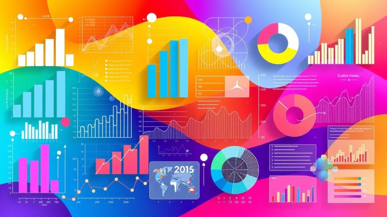
The human brain processes visual information 60,000 times faster than text. This fact highlights the power of data visualization in our data-driven world. Visual data helps us make sense of vast amounts of information quickly.
Data Analysis
Data visualization bridges complex datasets and human understanding. It converts numbers into charts and graphs. This approach reveals trends, patterns, and outliers that might stay hidden in spreadsheets.
Visual data analysis speeds up interpretation and leads to better decisions. It works across various fields, from business to science.
Graphical representation has a deep impact on data analysis. It makes data accessible to more people, not just statisticians and data scientists. Visual data helps executives and policymakers grasp complex concepts quickly.
This accessibility improves communication and teamwork. It allows for better decision-making based on clear, visual insights.
Preparing for the UGC NET exam can be a daunting task, but with the right resources, candidates can navigate the process effectively. Websites like MyJRF provide a comprehensive platform for aspiring educators, offering specialized guidance for UGC NET Paper 2 preparation and essential tips for acing UGC NET Paper 1. Additionally, understanding the revised syllabus provided by UGC is crucial for a targeted study approach. For official announcements and updates, candidates should regularly visit the UGC NET NTA portal, while the UGC’s job section and the main UGC website are invaluable for post-exam opportunities and academic resources. With these tools, candidates can maximize their preparation and set themselves up for success.
Key Takeaways
- Visual data is processed 60,000 times faster than text
- Data visualization bridges complex datasets and human understanding
- Graphical representation reveals hidden patterns and trends
- Visual data analysis speeds up interpretation and decision-making
- Data visualization makes complex information accessible to broader audiences
Understanding Data Analysis and Its Importance
Data analysis is crucial for modern decision-making across industries. It uncovers patterns in raw data to support informed choices. In today’s world, mastering this skill is vital for businesses and researchers.
What is Data Analysis?
Data analysis examines, cleans, and transforms data to discover useful information. It uses techniques like machine learning and data mining to extract insights. This process helps organizations make better decisions and predict future trends.
Benefits of Data Analysis
Effective data analysis offers numerous advantages:
- Improved decision-making
- Increased operational efficiency
- Better customer understanding
- Risk mitigation
- Competitive advantage
Common Methods Used in Data Analysis
Analysts use various techniques to extract insights from data:
| Method | Description | Application |
|---|---|---|
| Statistical Analysis | Uses mathematical models to interpret data | Market research, scientific studies |
| Machine Learning | Employs algorithms to learn from data patterns | Predictive analytics, image recognition |
| Data Mining | Discovers patterns in large datasets | Customer segmentation, fraud detection |
These methods help organizations unlock their data’s full potential. They drive innovation and growth in a competitive landscape. By using these tools, companies can stay ahead in their industries.
The Role of Visualization in Data Analysis
Data visualization transforms raw numbers into meaningful insights. It makes complex information easier to understand. This visual approach is crucial in business intelligence and decision-making.
Why Visualization Matters
Visual data helps us process information faster and more effectively. Our brains quickly recognize patterns and trends in visual formats. This makes data visualization powerful for spotting key insights often missed in spreadsheets.
How Visualization Enhances Understanding
Data visualization enhances understanding by:
- Simplifying complex data sets
- Highlighting trends and patterns
- Enabling quick comparisons
- Facilitating communication of insights
These benefits make data visualization essential for business intelligence strategies. Visual data helps companies make informed decisions faster and more confidently.
| Aspect | Traditional Data Analysis | Data Visualization |
|---|---|---|
| Speed of Understanding | Slow | Fast |
| Pattern Recognition | Difficult | Easy |
| Communication Effectiveness | Limited | High |
| Decision-Making Support | Moderate | Strong |
Data visualization techniques help analysts unlock their data’s full potential. This drives better outcomes in fields ranging from marketing to scientific research.
Types of Graphical Representations
Data visualization turns raw numbers into meaningful insights. It’s a key part of statistical analysis. Let’s look at three common graphs used to show data clearly.
Bar Graphs: Simplifying Comparisons
Bar graphs are great for showing differences between categories. They use rectangular bars to represent data values. The bar’s length matches the quantity it represents.
This makes it easy to compare values across different groups. You can quickly see which categories are larger or smaller.
Line Graphs: Tracking Changes Over Time
Line graphs shine when displaying trends over time. They connect data points with lines, revealing patterns and changes. This type works well for showing how things change across different periods.
Pie Charts: Illustrating Proportional Data
Pie charts show parts of a whole. They split a circle into slices, each representing a percentage. This method is great for displaying the makeup of a dataset.
| Graph Type | Best Use | Key Feature |
|---|---|---|
| Bar Graph | Comparing categories | Rectangular bars |
| Line Graph | Tracking trends over time | Connected data points |
| Pie Chart | Showing proportions | Circular slices |
Picking the right graph depends on your data and message. Each type has its strengths in showing complex information clearly.
Tools for Data Visualization
Data visualization tools are key for big data analysis and business intelligence. They turn complex data into clear, actionable insights. These software solutions help businesses make informed decisions.
Popular Visualization Software
Several powerful tools lead the data visualization market:
- Tableau: Known for its user-friendly interface and robust features
- Power BI: Microsoft’s offering, integrating well with other Office products
- R: Popular among statisticians for its programming flexibility
Selecting the Right Tool
Picking the best tool depends on various factors. Consider data size, user skill level, and integration needs. Your budget may also influence your choice.
| Factor | Consideration |
|---|---|
| Data Size | Some tools handle big data better than others |
| User Skill Level | Novices may prefer intuitive interfaces, while experts might opt for more customizable options |
| Integration Needs | Consider compatibility with existing systems and data sources |
| Cost | Budget constraints may influence your choice |
Evaluate these factors carefully to find the right tool. A good choice will boost your data analysis abilities. It will also align with your business intelligence needs.
Best Practices for Creating Effective Graphs
Impactful graphs are key for successful data visualization. By following best practices, you can clearly communicate complex information. Your graphs will be more effective and easier to understand.
Keep it Simple
Simplicity is vital for effective data visualization. Avoid cluttering your graphs with unnecessary elements. Focus on presenting only the most relevant data points.
Choose clean, easy-to-read fonts and use a limited color palette. This prevents visual overload. The goal is to make your data easily digestible at a glance.
Use Labels and Legends Wisely
Clear labeling is crucial for proper data interpretation. Use concise, descriptive labels for axes, data points, and chart titles. Place legends strategically, ensuring they don’t obstruct the main visualization.
When dealing with multiple data sets, use distinct colors or patterns. This helps viewers quickly grasp the information without confusion.
- Choose appropriate chart types for your data
- Maintain consistency in design across related graphs
- Use white space effectively to improve readability
- Test your visualizations with your target audience
Following these practices will help you create professional-looking graphs. Your visualizations will effectively convey your data’s story. Strive for a balance between aesthetic appeal and informational clarity.
Interpreting Visual Data
Visual data is crucial in modern statistical analysis. Graphs and charts reveal hidden patterns in numbers. Let’s explore how to use these visual tools effectively.
Analyzing Patterns in Graphs
When examining graphs, look for shapes and trends. Line graphs show changes over time. Bar graphs compare different groups. Pie charts display parts of a whole.
Each graph type reveals unique patterns in your data. Pay attention to these details for a deeper understanding.
- Are there any clear upward or downward trends?
- Do you see any repeating cycles?
- Are there sudden changes or jumps in the data?
Identifying Trends and Outliers
Trends show the general direction of your data. They can rise, fall, or stay steady. Outliers are data points that don’t fit the overall pattern.
Both trends and outliers are crucial in data interpretation. They provide valuable insights into your dataset.
Here’s a simple guide for spotting trends and outliers:
| Feature | How to Identify | What It Means |
|---|---|---|
| Trend | Look for consistent movement in one direction | Shows long-term changes in data |
| Outlier | Find points far from the main cluster of data | May indicate errors or special events |
| Seasonality | Check for regular patterns that repeat | Reveals cyclical changes in data |
Context is key in data interpretation. A trend might be normal in one setting but problematic in another. Always consider the bigger picture in your analysis.
Case Studies: Visualization in Action
Data visualization turns raw numbers into powerful insights across various fields. Visual representations drive decision-making in business and scientific research. Let’s explore real-world examples of this transformative process.
Business Applications
Companies use data visualization to gain a competitive edge. An e-commerce platform analyzed customer behavior with interactive dashboards. This led to a 15% increase in sales conversions.
A manufacturing firm used predictive analytics to forecast equipment failures. Their visual model showed potential breakdown points. This reduced downtime by 30% and saved millions in repair costs.
Scientific Research Insights
Visualization helps scientists understand complex phenomena. Climate scientists used 3D models to show global temperature changes over time. This visual approach helped policymakers grasp the urgency of climate action.
Medical researchers used heat maps to visualize gene expression data in cancer studies. This method revealed new patterns. It led to targeted therapies and improved patient outcomes.
| Field | Visualization Type | Impact |
|---|---|---|
| E-commerce | Interactive Dashboards | 15% Increase in Sales |
| Manufacturing | Predictive Models | 30% Reduction in Downtime |
| Climate Science | 3D Temperature Models | New Environmental Policies |
| Medical Research | Gene Expression Heat Maps | Improved Cancer Treatments |
These examples show how data visualization transforms diverse fields. It enhances business intelligence and advances scientific discoveries. The power of visual data representation is clear across industries.
Integrating Visualization into Your Analysis Workflow
Data analysis and business intelligence thrive on strong visualization practices. Visual elements in your workflow uncover insights faster. They also help communicate findings more effectively.
Steps for Incorporation
Identify key points where visualization can add value to your data analysis process. These may include:
- Initial data exploration
- Pattern recognition
- Trend analysis
- Final reporting
Choose visualization tools that match your data types and business intelligence needs. Train your team on these tools for consistent use across projects.
Collaboration and Sharing Insights
Visual representations improve collaboration in data analysis projects. Use shared dashboards or interactive reports to keep team members informed. This approach allows for real-time updates and promotes a data-driven culture.
Customize your visuals for stakeholders based on their needs and data literacy. Clear, concise visuals bridge the gap between complex analysis and actionable intelligence.
“A picture is worth a thousand words, but in data analysis, it could be worth millions in informed decisions.”
Integrating visualization throughout your analysis workflow enhances understanding and improves decision-making. It also maximizes the impact of your data-driven insights.
Common Mistakes in Data Visualization
Data visualization helps interpret complex information. Many people make mistakes that hinder effective communication. Let’s explore these pitfalls and how to avoid them.
Overcomplicating Designs
One common error is creating overly complex designs. Cluttered graphs with too many elements can confuse viewers. They can also hide key insights.
Keep your visuals clean and focused on the main message. Simple designs often convey information more effectively.
Use color sparingly and choose chart types that best represent your data. Bar charts work well for comparisons. Line graphs excel at showing trends over time.
Ignoring Audience Needs
Another mistake is not considering the audience when creating visualizations. Different groups have varying levels of expertise in data interpretation. Tailor your visuals to match your audience’s knowledge and expectations.
Consider these factors when designing visualizations for your audience:
- Technical background
- Familiarity with the subject matter
- Time available to analyze the data
- Specific questions they need answered
By addressing these aspects, you can create better data visualizations. Your visuals will resonate with your audience and improve understanding.
| Mistake | Impact | Solution |
|---|---|---|
| Overcomplicating designs | Confusion and misinterpretation | Simplify charts, focus on key data points |
| Ignoring audience needs | Lack of engagement and understanding | Tailor visuals to audience expertise and goals |
| Using inappropriate chart types | Misrepresentation of data relationships | Choose charts that match data characteristics |
The Future of Data Visualization
Data visualization is changing fast due to tech advances and big data analysis needs. New trends are emerging. These will change how we understand complex information.
Emerging Trends
AI and machine learning are reshaping data visualization. They create dynamic, intelligent data representations that adapt to user needs. Interactive visualizations now let users explore data layers easily.
These tools help uncover deeper insights. Users can interact with data in new ways.
Technology’s Impact on Data Representation
Tech progress is creating immersive data experiences. Virtual and augmented reality offer new ways to represent data. Analysts can now step inside their data.
This isn’t just about better visuals. It’s about finding patterns and making decisions more intuitively.
Data visualization is becoming more accessible and powerful. This helps businesses and researchers extract insights faster. It leads to better decision-making across various fields.
FAQ
What is data visualization and why is it important?
Data visualization turns complex information into easy-to-understand graphics. It helps spot patterns and trends in data quickly. This makes it easier to interpret information and make decisions based on it.
How does data visualization enhance data analysis?
Data visualization makes complex information easier to understand. It helps identify patterns and trends faster. This leads to better decision-making as data becomes more accessible to our brains.
What are some common types of graphical representations used in data analysis?
Bar graphs compare categories, while line graphs show changes over time. Pie charts display proportional data effectively. Scatter plots, heat maps, and box plots serve specific purposes in data analysis.
What tools are available for creating data visualizations?
Many tools exist for data visualization, from basic spreadsheets to advanced platforms. Popular options include Tableau, Power BI, and R. Python libraries like Matplotlib and D3.js are great for web-based visualizations.
What are some best practices for creating effective graphs?
Keep designs simple and use labels wisely. Choose appropriate colors and consider your audience’s needs. Ensure your visualization accurately represents data without distortion.
Maintain consistency in design elements. Provide clear titles and axis labels for easy interpretation.
How can I avoid common mistakes in data visualization?
Avoid overcomplicating designs and use appropriate visualizations for your audience. Don’t use misleading scales or comparisons. Provide context for your data and choose the right chart type.
Be mindful of color choices to ensure accessibility. Seek feedback and improve your visualizations regularly.
How is machine learning impacting data visualization?
Machine learning enables more advanced analysis of large datasets. It identifies patterns and anomalies for visualization. This leads to dynamic, interactive tools and predictive visualizations.
What is the role of data visualization in business intelligence?
Data visualization turns raw data into actionable insights for businesses. It helps understand market trends, customer behavior, and performance quickly. Visualizations in dashboards allow decision-makers to grasp complex information easily.
How can I integrate data visualization into my analysis workflow?
Identify key points where visual representation could enhance understanding. Use visualization tools that work well with your analysis software. Create a standard approach for making visualizations.
Establish design and interpretation guidelines. Share visualizations with team members throughout the analysis process.
What are some emerging trends in data visualization?
Interactive and immersive visualizations are on the rise. Real-time data streaming and VR for data exploration are becoming popular. Storytelling through data is gaining traction, using visuals to present insights.
AI is being used more for automated insight generation and visualization recommendations.